
My 10-colour palette of Daniel Smith watercolours

The Daniel Smith watercolours are now loaded into my small Bijou box. Not my box of preference because the mixing area is quite small, but I've no other box.

These are the 10 colours that I've chose.
- Lemon Yellow (PY175) - Transparent, Low staining, Granulating, LF Excellent
- New Gamboge (PY153) - Transparent, Low staining, LF Excellent
- Quinacridone Red (PV19) - Transparent, Medium staining, LF Excellent
- Quinacridone Magenta (PR202) - Transparent, Medium staining, LF Excellent
- Viridian (PG18) - Transparent, Granulating, LF Excellent
- Sap Green (PO49 PG7) - Transparent, Medium staining, Granulating LF Excellent
- French Ultramarine (PG29) - Transparent, Medium staining, Granulating, LF Excellent
- Phthalo Blue GS (PB15) - Transparent, Medium staining, LF Excellent
- Italian Burnt Sienna (PBr7) - Semi-transparent, Granulating, LF Excellent
- Permanent Brown (PBr25) - Transparent, Medium staining, LF Excellent
Most of these are single pigment paints, except Sap Green.
If you look at the colour index, i.e. PY175, P means Pigment, Y means Yellow and 175 the particular type of that pigment. When you mix single pigment paints, their mixture will still turn out bright and fresh.
I'm currently using Winsor and Newton watercolours. Daniel Smith's viridian seems less intense than WN, which is so bright and striking it always has to be toned down by mixing. Italian Burnt Sienna seems also less red but maybe because it's Italian instead of the standard Burnt Sienna. Quinacridone Red is more towards pink. The other colours look similar to WN's.
I've chosen these colours for their transparency, and avoided mostly the opaque cadmium colours. It's good to see that they are fairly transparent. Transparent colours are great for sketching because you need the lines to show through.

The secondary colours mixed from the primary colours look nice. French Ultramarine looks like the only granulating colour. The cooler colours have a more pastel feel.

Lemon Yellow mixed with Quinacridone Magenta and Quinacridone Red. Quinacridone are quite intense, and in this case warm. They are medium staining strength.

Lemon Yellow mixed with French Ultramarine and Phthalo Blue. Very pastel colours result.

New Gamboge mixed with Quinacridone Magenta and Quinacridone Red. Lovely shades of orange from the warm New Gamboge and Quinacridones.

New Gamboge mixed with French Ultramarine and Phthalo Blue.

Quinacridone Red and Quinacridone Magenta mixed with French Ultramarine and Phthalo Blue. The mixtures are quite dark and needs to be watered down for glazing.

Viridian mixed with the earth colours Italian Burnt Sienna and Permanent Brown.

Sap Green mixed with the earth colours Italian Burnt Sienna and Permanent Brown.

Mixing some grays here with Viridian and Quinacridone Magenta, French Ultramarine and Italian Burnt Sienna. I like mixing Burnt Sienna with French Ultramarine for their granulating grays.

Permanent Brown mixed with the blues, French Ultramarine and Phthalo Blue. Italian Burnt Sienna mixes well with the Phthalo Blue to give a nice gray as well, still with hints of Burnt Sienna.
You can find Daniel Smith Watercolors on Amazon, Dick Blick Art Materials (US) and Jackson's Art (UK)
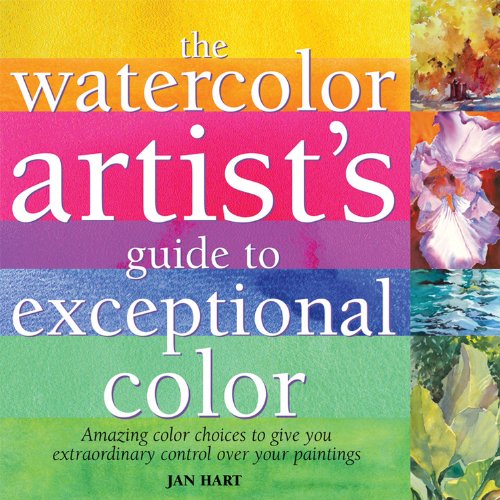
To learn more about watercolour mixing, get this book The Watercolor Artist's Guide to Exceptional Color.
Update 2021
If I were to update my palette today, these are the colours I'll swap
Quinacridone Magenta PR202 with Quinacridone Lilac PR122 which is slightly more vibrant. PR122 is a pigment commonly used by other manufacturers as their Quinacridone Magenta.
Permanent Brown PBr25 will be replaced with Pyrrol Scarlet PR255. I actually kinda prefer a warm colour palette. Pyrrol Scarlet will mix well with Phthalo Blue to produce a really dark colour that's close to black.
Viridian will be replaced with Hansa Yellow Medium PY97 or Azo Yellow PY154 or Nickel Azo Yellow PY150. I'll still be able to mix a cool green with Phthalo Blue. Adding another primary colour will make colour mixing more versatile.
So the updated palette will be:
- Lemon Yellow PY175
- Hansa Yellow Medium PY97
- New Gamboge PY97 + PY110
- Pyrrol Scarlet PR255
- Quinacridone Red PV19
- Quinacridone Liliac PR122
- Phthalo Blue (GS) PB15:3
- French Ultramarine PB29
- Burnt Sienna PBr7
- Sap Green PO48, PY150, PG7
I may even swap Sap Green for another blue, eg. Cerulean Blue Chromium PB36 or Manganese Blue PB15.
For a 12-colour palette, I'll add Cerulean Blue Chromium and some other colour I'll want to experiment with.


