
5 Questions for Night Diver Press (Lena Gustafson & Peter Calderwood)
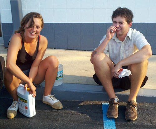
Night Diver Press (facebook) is a print/illustration team based in San Francisco run by Lena Gustafson and Peter Calderwood.
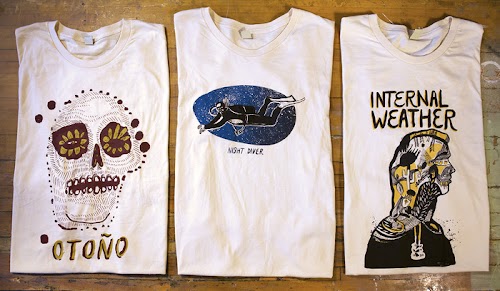
They work on silkscreen prints, hand-bound books, t-shirts, show posters, album covers, murals and other creative projects.
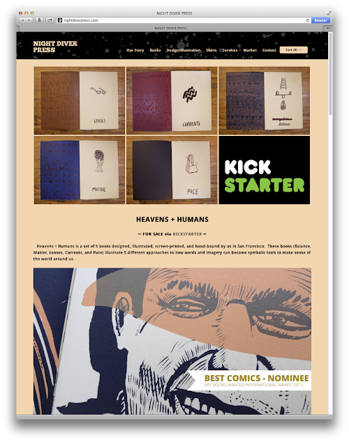
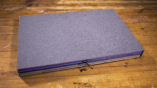
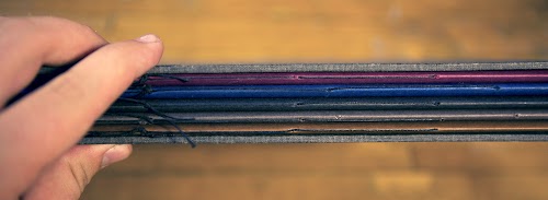
Currently, they are running a Kickstarter campaign for their set of 5 silkscreen printed books. You can check them out at https://kck.st/16j7G17. It ends on 14 Nov 2013.
Here's a short interview with them about the books.
Q: Can you introduce us to who you are and why you've decided to form Night Diver Press?
Lena:
Well, we were both going to two different art schools in Boston at the same time. We met through a mutual friend and started hanging out.
I was studying illustration and Pete was going to school for screen printing and sculpture. We kinda just started working on projects together and realized our skills compliment each other really well. It's sort of surprising to us every time we finish a project what it turns into.
That's the cool thing about collaborating. You offer what you do and they offer what they do and then you have something full and complete that you couldn't have predicted. That's really what we want to promote with Night Diver Press.
Q: Your company Night Diver Press specialises in silkscreen printing. Why did you choose this medium for creating your book as compared to say, digital printing?
Pete:
Screen printing has a long history of being a medium for taking the capitol "A" out of art and bringing it to the people.
Compared to other fine art printing its cheap, fast, and effective to make a beautiful and elegant print by hand.
I have nothing against digital print media. We actually printed an edition of our books digitally and cheaper and they look great, however the work that I like to see and therefore like to make has a hand-made element to it.
Q: What are the challenges in creating the 5 books?
Pete:
Honestly, I think the hardest part was not spending too much time on any one particular page or book. We really wanted to keep the imagery loose and maintain the freshness of each original drawing. It was interesting having the illustration be so fast compared to the printing and binding. The other stuff takes a lot of time, but the tight binding and print compliments the loose imagery really well.
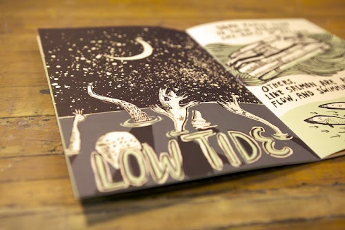
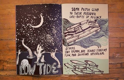
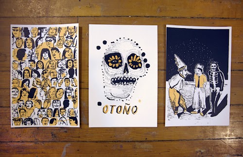
Q: The illustration style in Heavens + Humans uses a lot of black and line art that similar to comic illustrations. Can you talk about your influence and why you chose this style for the book?
Lena:
I have been drawing for a long time. My influences from the "Mission School" artists of San Francisco, as well as having a constant sketchbook with me have shaped my drawing style.
The idea behind making these books was to really try to keep to looseness and "error" of sketchbook drawings. But it was interesting when I was creating images with the silk screen print in mind because I would draw directly onto acetate instead of paper.
Pete and I got into a fluid system for getting each page ready for print. We'd use large fields of flat color, which brought the loose drawing into a complete stage. This also shaped the style for each book.
Q: Of the 5 books you've made, which one is your favourite and why?
Pete:
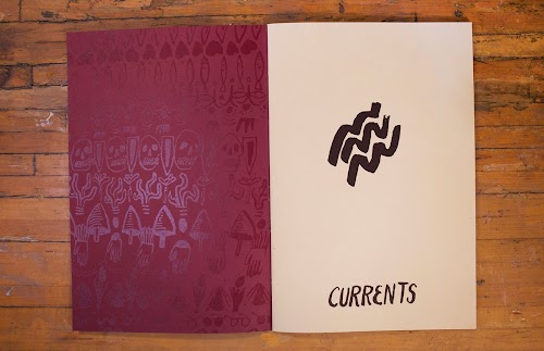
I really like Currents mostly because of the colors.
Lena:
For me, probably Balance. A lot of the ideas for those pages came from when I was in living in Mexico for 3 months. For me, that book has the most potency of emotion. But it's really cool to see how and why different people are drawn to different books.
Check out their Kickstarter campaign at https://kck.st/16j7G17
It ends on 14 Nov 2013.


Add new comment