
my sketches
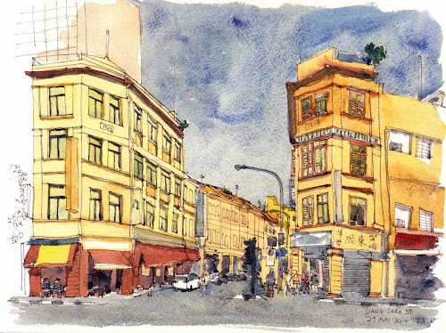
Beatty Lane
This was sketched at Beatty Lane, Singapore.
I'm trying out a Kremer Pigments palette. There are 14 colours in the box but I only used five, namely, Pyramid Yellow, Venetian Red, Cobalt Turquoise Light, Chrome Oxide Green and Burnt Umber.
It's a rather low saturation colour scheme.

10 by 10 inch DR Aquafine CP watercolour paper, Kremer Pigments

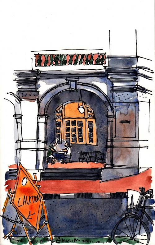
Oromo Coffee sketch

This is Oromo Coffee at Shaw Towers, Singapore. It's a nice place to chill. The air-con is very cold. There wasn't any customers when I drew this.
The ink lines were added after watercolour was added. I was using the Winsor & Newton Desert Collection of watercolours that mentioned in a previous post. It's good for sketching cafes because of the many warm colours included in the set.
The watercolour paper is Saunders Waterford 300GSM Coldpress.
From Carver St
Schmincke watercolour, 12 by 9 inch Waterford CP watercolour paper
I've seen this view countless times and finally decided to sketch it. It's drawn from Carver St, Singapore.

Cavan Road (25 Apr 2014)
Sketched at Cavan Road today with slightly more than an hour on hand.
I'm not particularly satisfied and will definitely be drawing this scene again. It looks rushed, it is rushed.

Saunders Waterford 300GSM Coldpress watercolour paper, Schmincke watercolours
Side of SAM
This afternoon, I was drawing by the side of the Singapore Art Museum.
What attracted me was basically the silhouette of the sky made by the building. By the way, the sky wasn't that dark, although it was cloudy and going to rain. The shadow was added from imagination to give the sketch a bit more depth.
I'm trying out the Waterford watercolour paper for the first time and I really like it. The cold press surface absorbs water well, and brings out the texture of watercolour beautifully. The paper is a bit off-white which I'm still getting used to.

Sharpie Extra fine, Waterford watercolour paper, Schminke watercolour pan
Raffles Hotel from Seah St (18 Mar 2014)
Sharpie Extra Fine, WN watercolours, Stillman & Birn Epsilon sketchbook.
This is at one corner of Raffles Hotel from Seah St. It's a rainy day for sketching and the watercolours took a while to dry.
Colours used: French Ultramarine, Burnt Sienna, Perm Alizarin Crimson, Winsor Yellow, Yellow Ochre, Cadmium Yellow, Viridian.


