
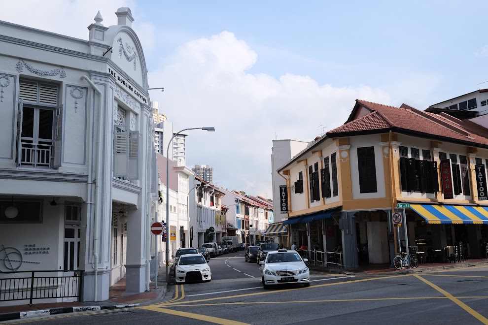
Neil Road Sketchwalk (11 Apr 2015)
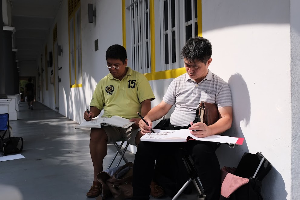
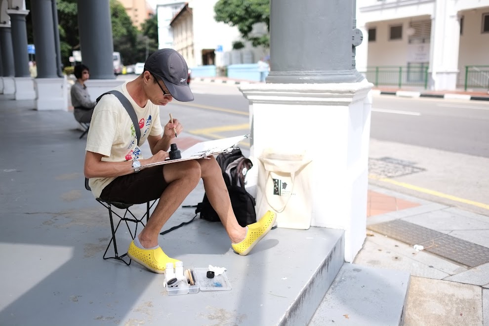
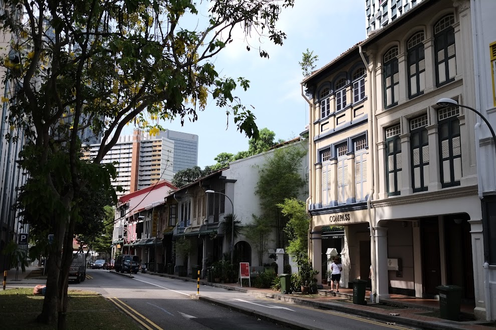
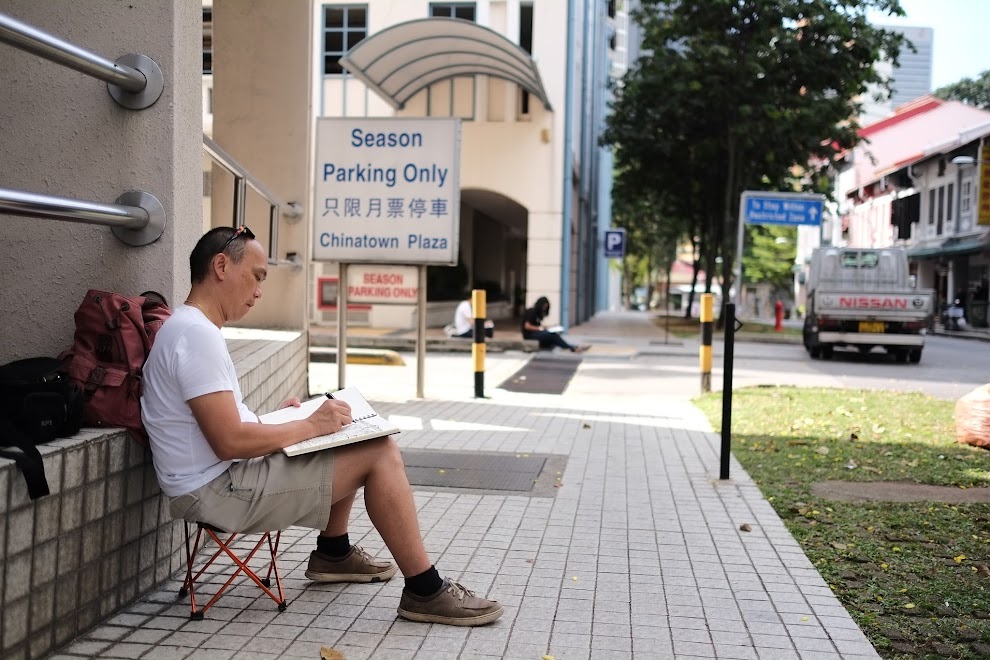
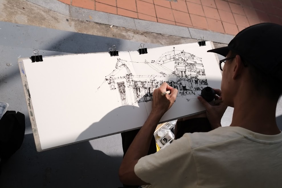
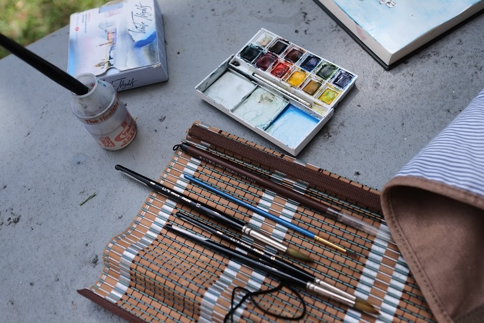
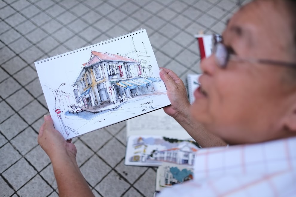
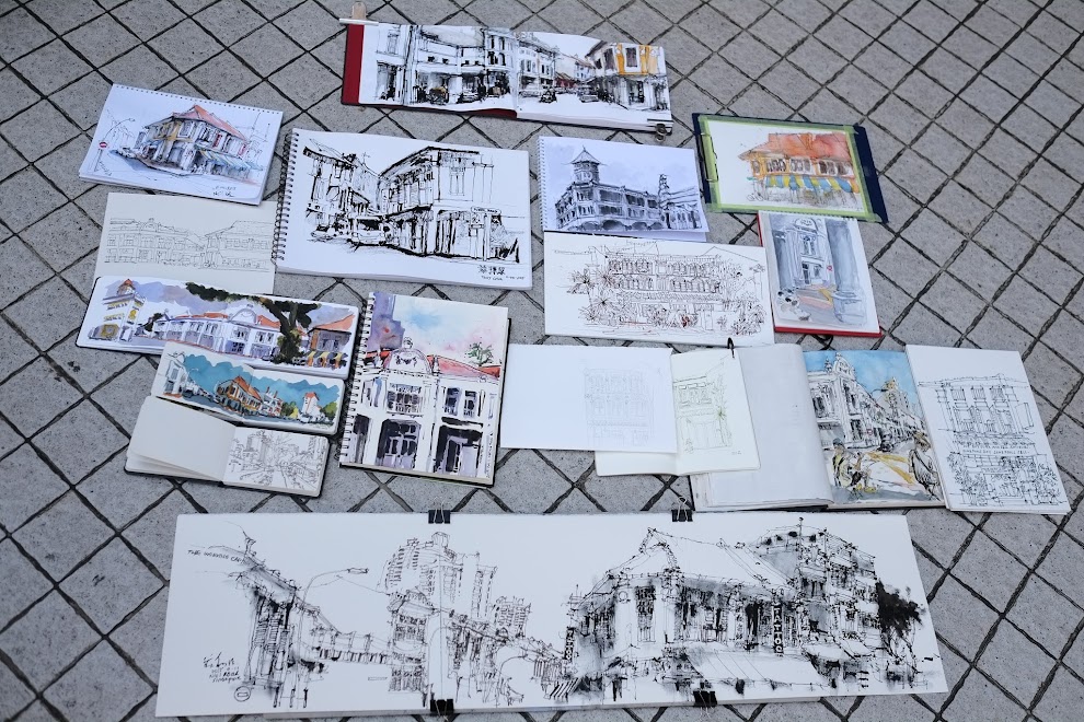
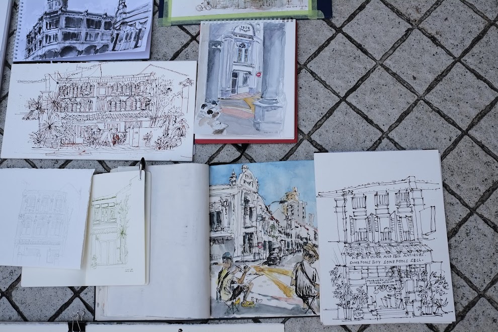
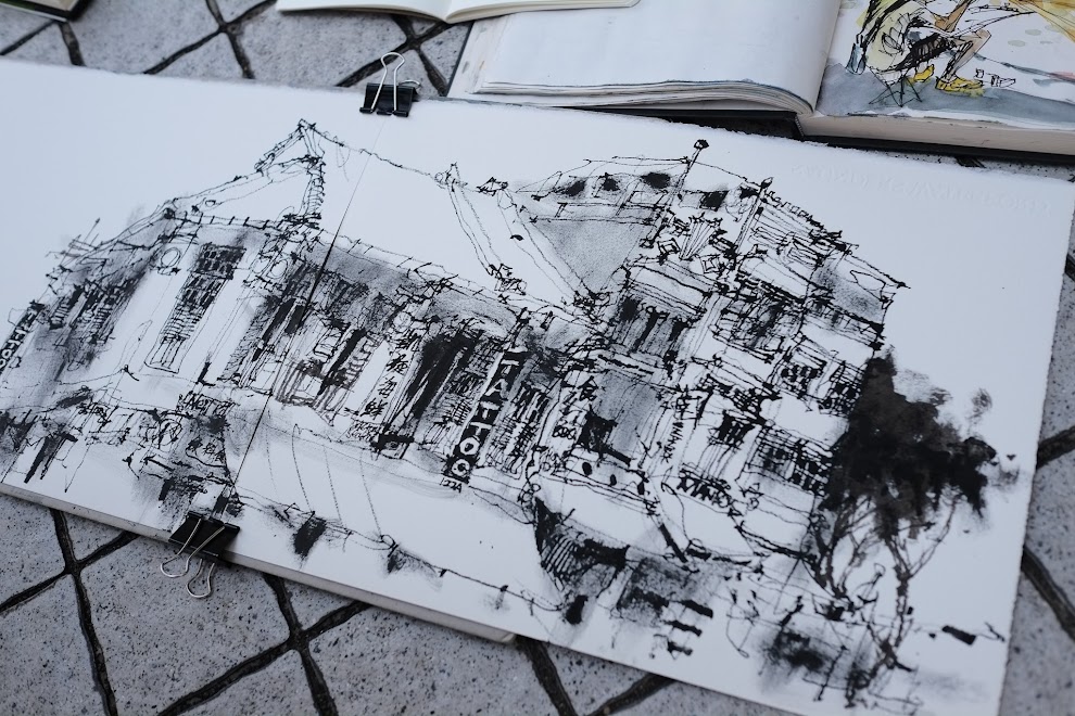
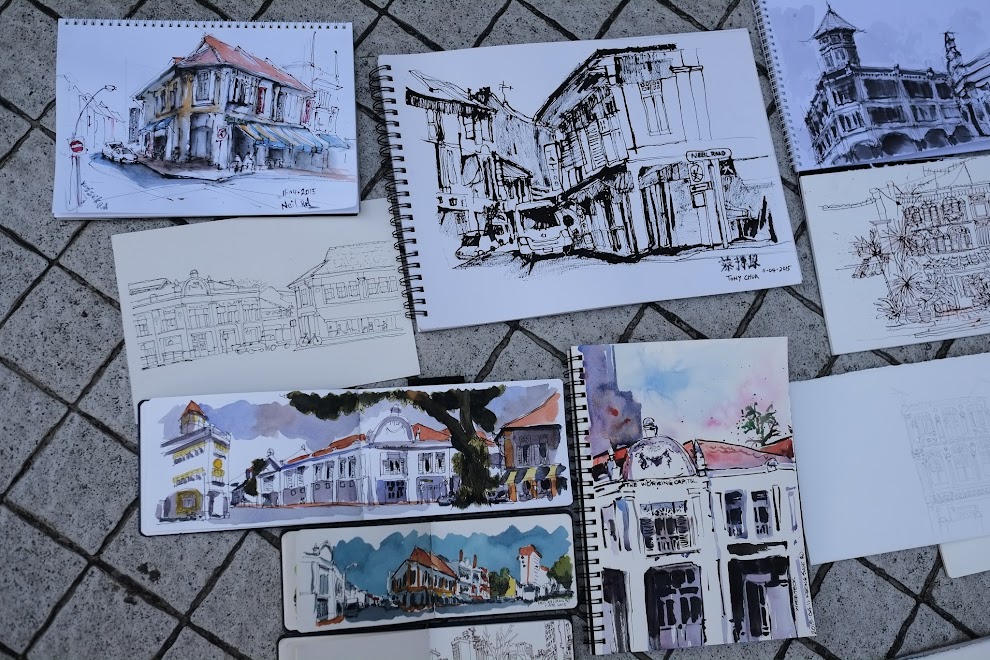
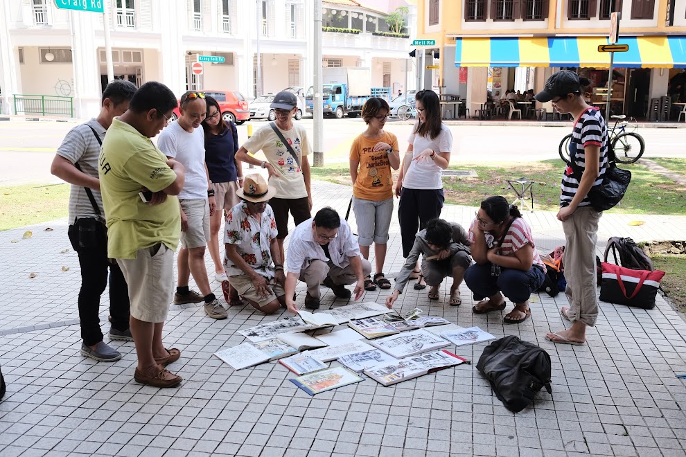
Here are some photos from today's mini sketchwalk at Neil Road, Singapore.
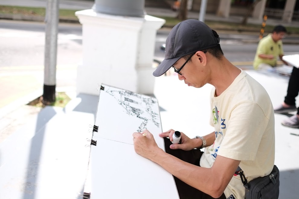
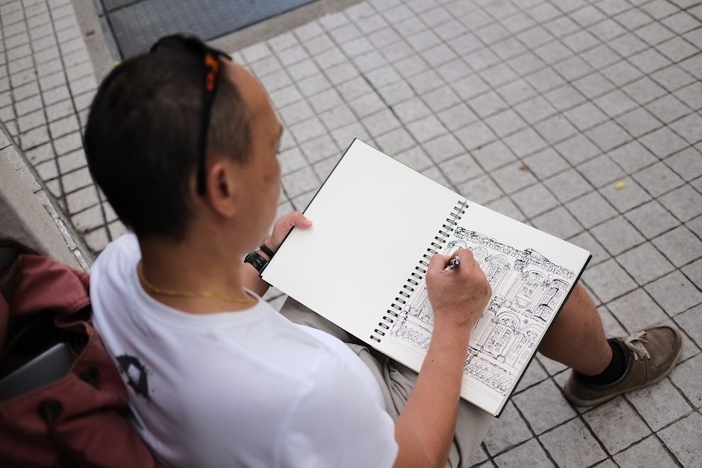
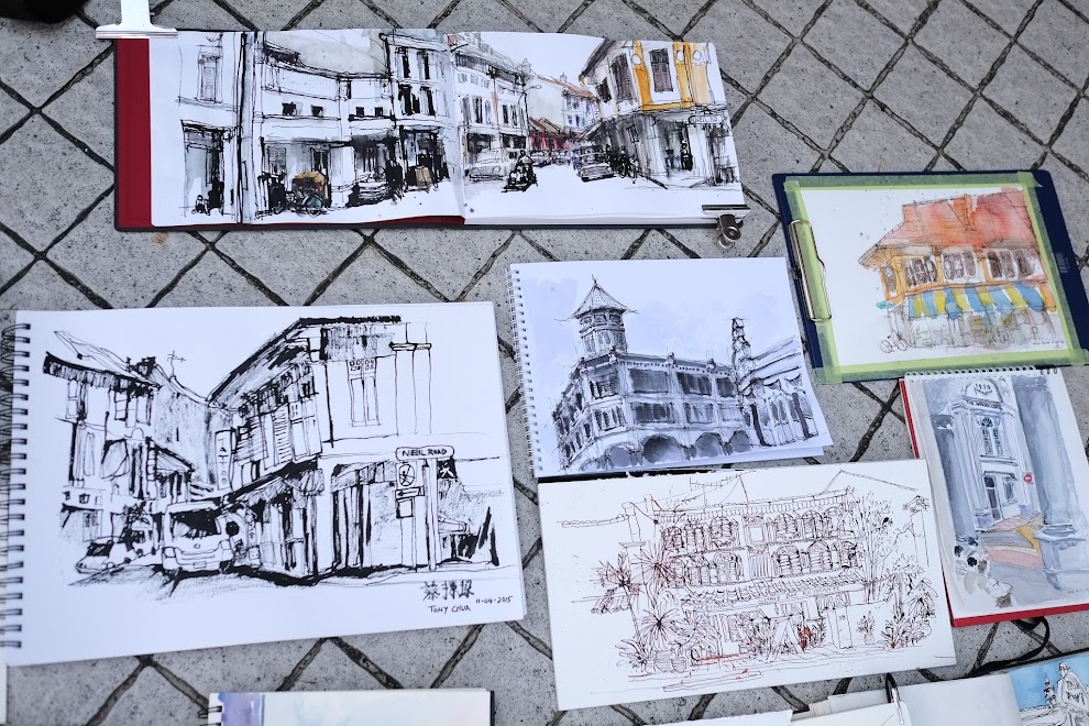
We have special guest Ch'ng Kiah Kiean (below) from Penang with us today.
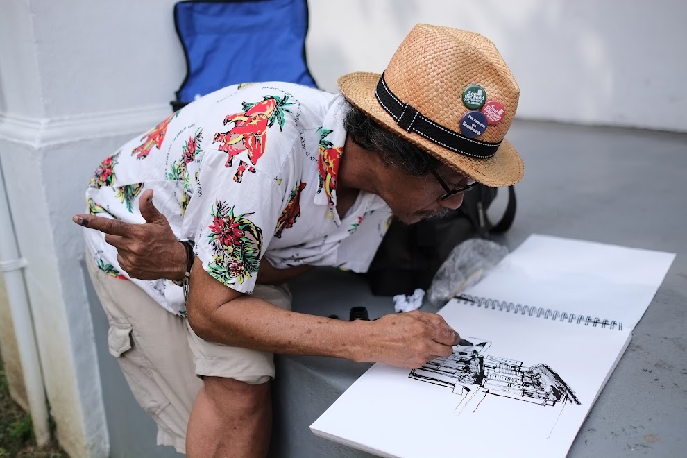

This is my first sketch. I was trying to create the fluffy clouds but didn't quite get it. I was using QoR watercolours today.

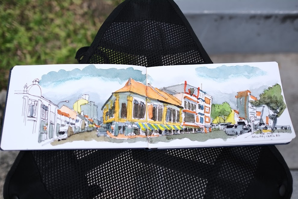
This was from exactly the same position. This was drawn on The Perfect Sketchbook while the first piece was on the Pentalic Watercolour Journal.
I've used a different set of primary colours for the two sketch although I can't remember exactly the colours. But what I know is the second sketch has Phthalo Blue.
Quite a few sketcher friends commented on the beautiful blue sketch from the second sketch. That's Phthalo Blue (Green Shade) mixed with a little Burnt Sienna to dull it down slightly. In it's pure form, Phthalo Blue is too bright and glaring and is too distracting to be used like that.
The interesting thing about Phthalo Blue is, with certain reds, it can mixed into something that's quite close to black. For example, Daniel Smith's Phthalo Blue (Green Shade) can mix with Transparent Pyrrol Orange to give you a really dark shade close to black. I love that mixture. For me, French Ultramarine and Phthalo Blue (Green Shade) are two blues that I absolutely must have in my palette.
I know many others also like to keep a Cerulean Blue or something close as a third blue as well for painting skies.
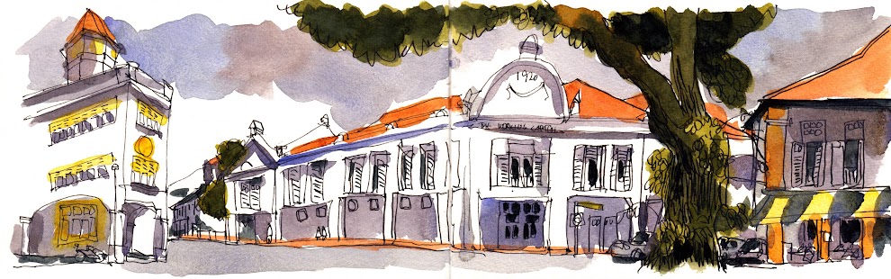
For the sky in this piece, I've used French Ultramarine Blue and Burnt Sienna of QoR watercolours. The French Ultramarine is slightly purplish. This mixture gives a more moody feel to the sky.

This was drawn after the sketchwalk at the Asian Civilisation Museum.
Add new comment