
Nila Colori watercolour swatches and first impression
Nila Colori contacted me recently and asked if I was interested to test their watercolour pans and of course I said I was interested. The company is based in Italy and their specialty is in making watercolour paint with natural or mineral pigments. This means you're not going to see chemical or synthetic colours like Phthalos or Quinacridones. You can check out photos of their products on their Instagram page.

These are the two sets of watercolour that I received. The wooden box set is the "12 Colors Premium Box" that cost € 58,24 (£51.88 | US $66.12). The small tin box is the "6 Colors Basic Box" that cost € 27,60 (£24.58 | US $27.60).
There's also the "8 Mineral Colors Box" which cost € 39,10 and a "3 Colors Intro Box" that's € 14,56

The packaging is nice but as you can see, it's not those palette boxes where you can mix your colours on.


The small tin has a beautiful stamp on it.


The pans are filled to the brim. The product code is written on the side or beneath the pan. For the pans that come in the small tin, there are small magnets glued to the bottom. The magnets prevent the pans from moving around too much in the tin.
The pans look wet above because I've just sprayed them with water before swatching them.

Luckily, I had a 18 half pan box that I haven't been using for a while, and it's now just the right box to hold all these colours. That's the Schmincke limited edition box. I don't think it's being sold anymore.
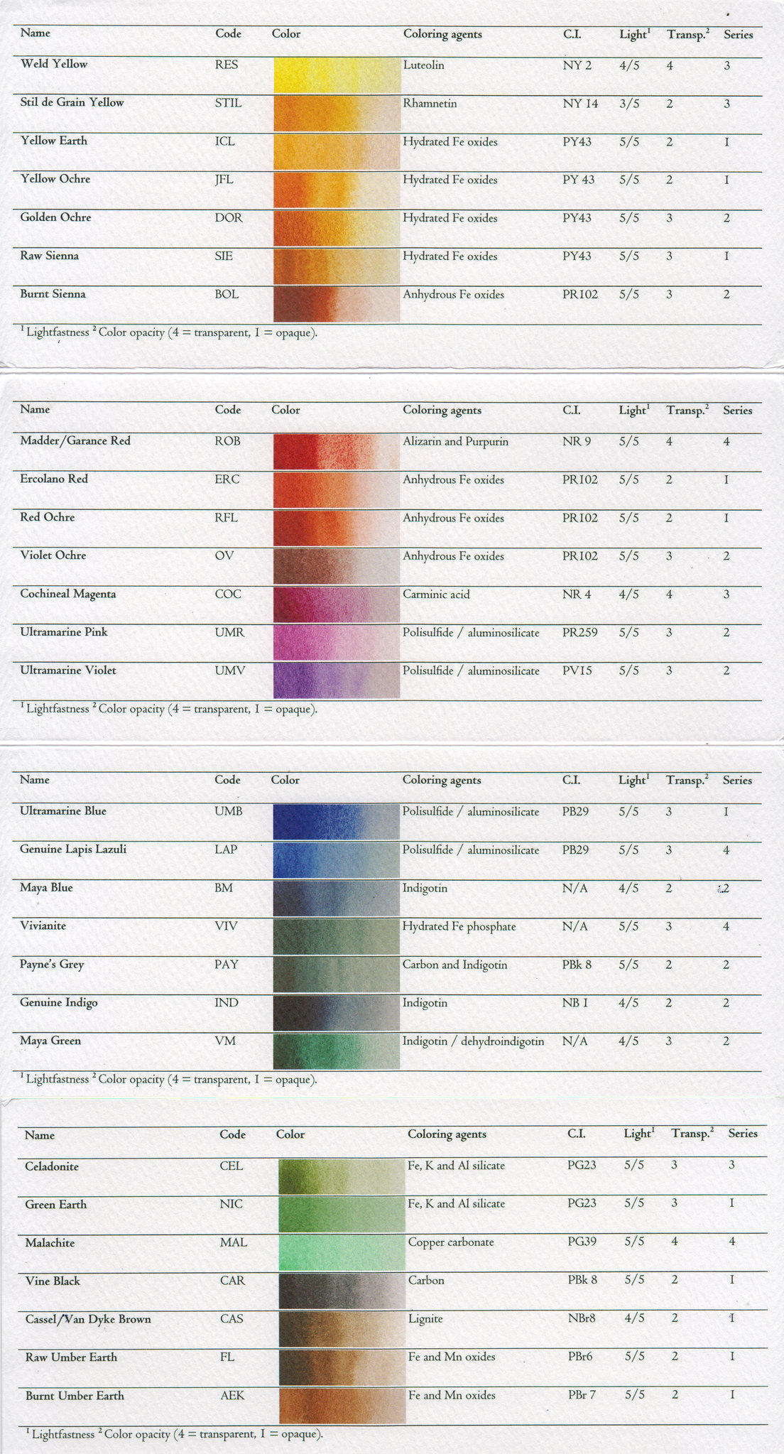
Note that you can't really tell what some of the colours are just by looking at the pans. You'll definitely need to swatch them out and label them.


Here are some quick observations from the swatches.
Weld Yellow was a bit difficult to dissolve compared to the other 17 colours. So it takes a bit more time to "scrub" out the paint.
Because the colours are made from natural or mineral pigments, they are not as intense compared to synthetic chemical colours. But overall, they are still considered quite vibrant. The only colours are weaker are Malachite and Genuine Lapis Lazuli.
I love the granulation for some of the colours. I haven't painted anything with them yet but I can expect paintings to have a very textured look.
Most of the colours are transparent so they should mix well with others.
Ultramarine Blue is more intense than I expected. I love it.
The reds have the earthy look. They are still red but different from the red we usually associate the colour with. These are Not the high intensity danger-red or fire engine-red like Pyrrole, Scarlet or Vermilion.
Note the lack of green. Maya Green and Malachite are definitely not greens we commonly see around. Malachite is a pastel-like colour. It's looks chalky but it's not chalky.
There's a good selection of earth tones included. Yellow Ochre, Red Ochre, Raw Sienna, Burnt Sienna, Raw Umber Earth, Burnt Umber Earth and the reds that look like earthy colours.
I'm not able to test the lightfast quality so I can only base that on the company's claim. Most colours are 5/5 while a small selection is 4/5. Lightfast quality is not something I worry about since most of my paintings are in sketchbooks.
Overall, the quality looks good. Can't wait to start painting with them.
Below's the scan of the colour chart pamphlet.
Add new comment