
Review: M. Graham Watercolor Paint Basic 5-Color Set
I have tried several brands of watercolors for my sketches and watercolor painting, but I have not tried M. Graham yet. However I have heard some of painter friends recommending and talking about their experience with M. Graham. And if you are also new to M. Graham like me, and do not wish to spend a fortune buying too many paints and then regretting later, the basic 5-color set is highly recommended. This is exactly the same reason I bought the basic set to test before I commit myself to getting the rest of the colors. Even if you are new to watercolor but want a fairly good watercolor paints to start with, M Graham might be the brand you may want to try out, as it has a long standing reputation of producing high quality artist paints.
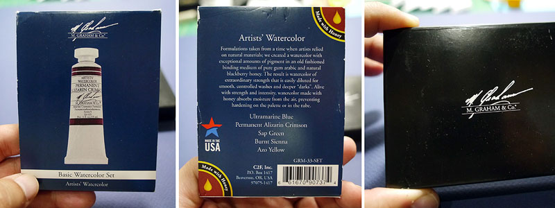
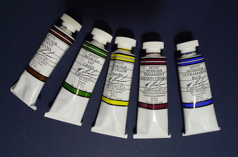
The basic box set comes with 3 Primary colors, a green and a brown. The color range is quite limited, but I would show how this limited palette is able to offer a good range of colors when mixed. The tubes in this box set are ½ ounce tubes; the Hues are namely, Alizarin Crimson, Ultramarine Blue, Azo Yellow or Aureolin, Sap Green and Burnt Sienna.
According to known sources, M Graham’s watercolor paints are manufactured with minimal use of fillers or brighteners, so you get real color intensities and good control when you mix your colors due to its heavy pigment load. The paints retain their brilliance even when diluted out. However it also means that the paints are very staining and therefore difficult to be lifted out when the paint dries on paper.
According to some experienced users, lightfastness of the paints is very good and is accurately reported on the products’ specification. The binding medium (from the box) used are medium of gum Arabic and natural blackberry honey that deters the paints from drying out too fast when they are squeezed onto the mixing palette.
Here are the information read off from the tubes:
Permanent Alizarin Crimson – Series 5
Lightfastness II
Vehicle: Gum Arabic
Conforms to ASTM D-4236
Pigment: Diketo Pyrrolopyrrol (PR 264)
Ultramarine Blue – Series 3
Lightfastness I
Vehicle: Gum Arabic
Conforms to ASTM D-4236
Pigment: Silicate of Sodium & Aluminum with Sulphur (PB 29)
Azo Yellow (Aureolin) – Series 2
Lightfadtness I
Vehicle: Gum Arabic
Conforms to ASTM D-4236
Pigment: Benzimidazolone Yellow (PZY 151)
Sap Green – Series 2
Lightfastness I
Vehicle: Gum Arabic
Conforms to ASTM D-4236
Pigment: Chlorinated Copper Pthalocyanine
Burnt Sienna – Series I
Lightfastness I
Vehicle: Gum Arabic
Conforms to ASTM D-4236
Pigment: Calcined Natural Iron Oxide (PBr 7)
Physically the tubes’ metal feels pretty sturdy and doesn’t deform easily. However it is still relatively easy to squeeze the paint out of the tube just with a light pressure. At the same time, with the tube’s medium sized mouth, the flow of the paint when the tube is squeezed is controlled too. The cap is soft to the touch and slides easily without sticking. The cap is reasonably sized to allow easy handling and turning from the mouth of the paint tube. Even if you have tightened the cap too much, it is still quite easy to unscrew it open.
Paint Properties
Basically the hues are brilliant as mentioned. The pigments for all the tubes are so intense you don’t need to squeeze out too much to get a good mixing. Paint texture is very consistent and mixing is easy. Even when the paint is dried on the palette, it is easily dissolved with water again, without loosing any of the paint quality when freshly squeezed from the tube.
In terms of color, I find that the yellow is slightly too intense and bright. It works better when it is diluted with more water. A. Crimson and Ultramarine are both very intense and bright. Their brilliancy retain even when they are very diluted with a lot of water.
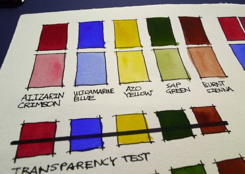
The transparency properties of the paints is relatively good. I think Azo Yellow is a little too opaque for a yellow. At the same time, it was quite impossible to lift up Yellow after it is dried on paper. The rest work pretty well.
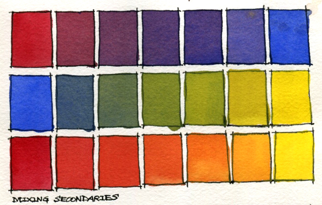
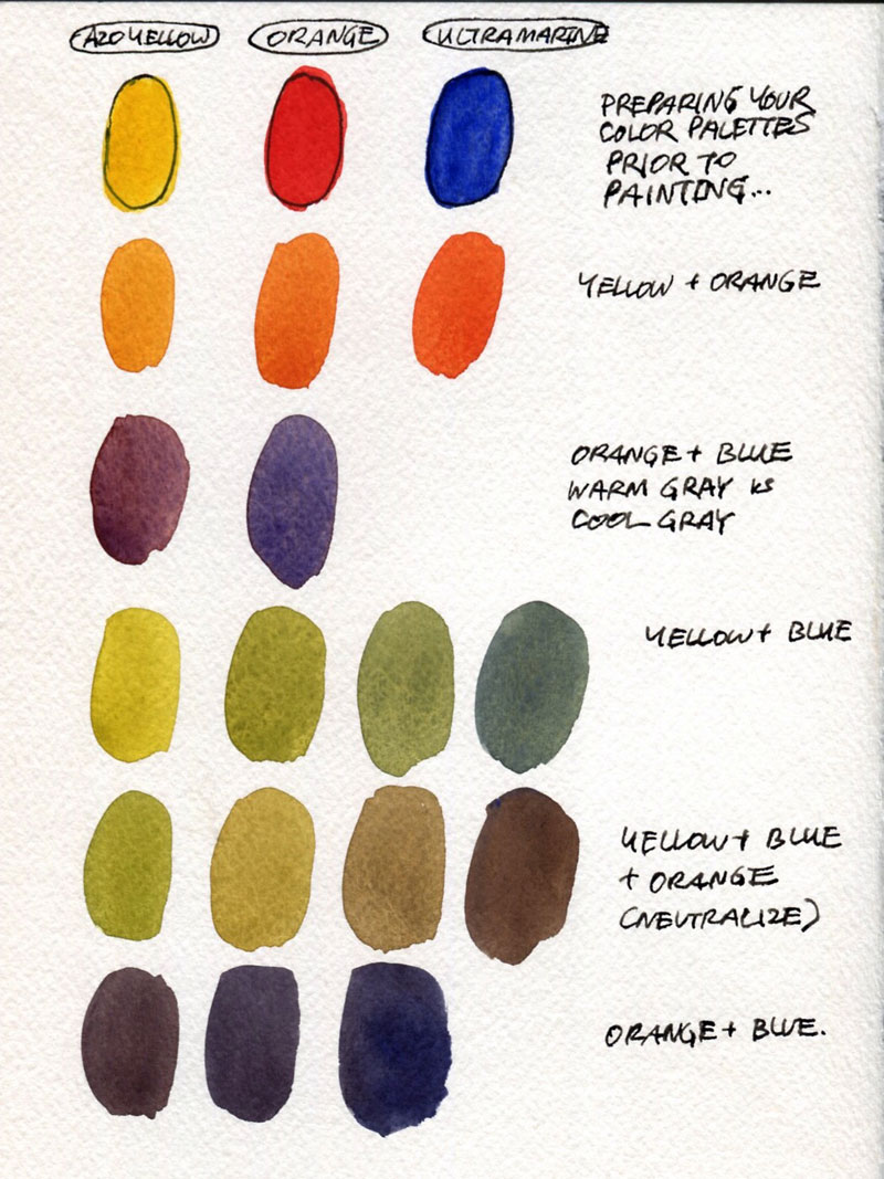
All the paints in the box mix very well with each other. The intensity and the rich pigments allow even the most subtle change in hue during color mixing. I really like how Ultramarine and Alizarin working so well together, the resulting violet is still bright and transparent with a little Ultramarine sediment in the paper texture.
The result of mixing secondaries of orange and green is not that ideal, as you can see from the result the not so transparent Azo Yellow results in a slightly dirty green and dulled orange. Still works great but care has to be given to not to add too much yellow and balance with sufficient water to thin it out a little.
Mixing Greys
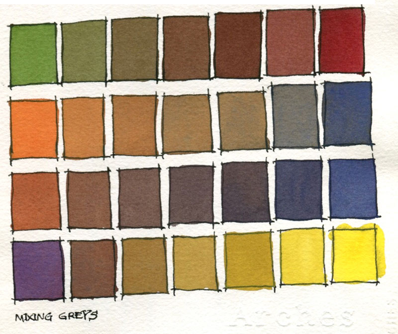
The result is fairly satisfactory. The subtle change in the range of greys is wonderful.
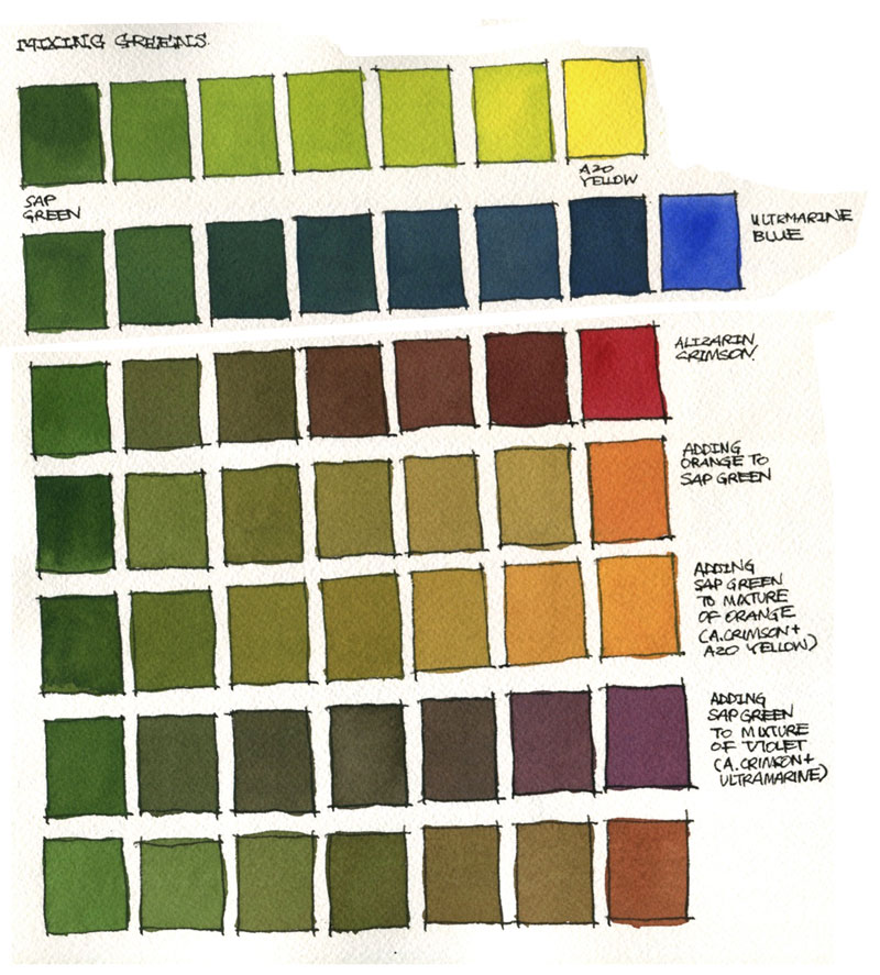
Mixing Greens
In mixing greens, I used the pre-mixed Sap green for the test, instead of using a mixture between Ultramarine and Azo Yellow. Putting Sap Green in the basic set is great because the hue reflects quite closely to the foliage green we see everyday. It is not exactly the green we see in our environment but it is ‘greyed’ enough to be a home-based green to start with while painting foliage.
Adding Azo Yellow to Sap Green in varying amount lightens and brightens the green if you are painting light on trees and grasses. Adding Ultramarine cools off the green and deepens the hue, relatively great for shadows of trees. Alizarin Crimson greys out the green adding more variety to the hue. You may also add mixed orange , violet and even Burnt Sienna to get a broader range of hues and a spectrum of warm and cool greens for your painting. You will also see that from my test, it is easier to add Sap Green to mixed Orange than it is vice versa.
In summary, adding violet to Sap Green dulls the green, whilst adding blue cools off or darkens it. Adding orange is more effective than adding red into green to get a warmer green hue.
Here’s a color wheel for your interest.
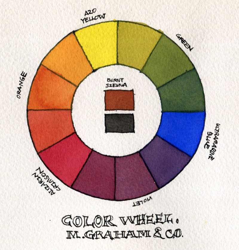
Look at how it is so easy to mix your secondary and the tertiary colors.
The above tests are done on Arches papers.
There may be just 5 colors in the basic set, but these form the limited color palettes sufficient to complete a painting. It is light weight and not too cumbersome to carry around if you are painting plein air. The range of colors you get through mixing these basic 5 colors is amazing. Here’s what you can do with a limited palette.
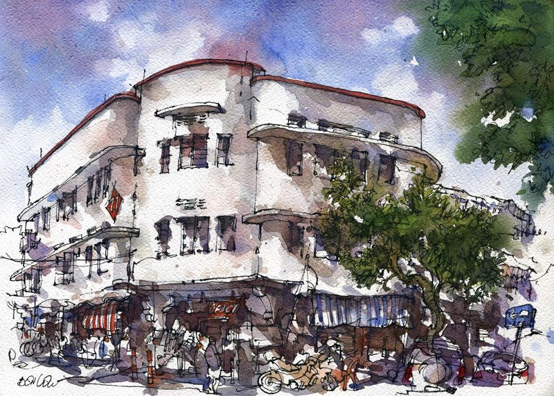
Title: Seng Poh Road in Tiong Bahru Precinct, Singapore
Size: 11" x 15" (Quarter Sheet)
Paper: Fabriano Artistico
Watercolor: M Graham
Pen: Hero Pen with Noodler's black ink
Availability
Find more reviews at Dick Blick Art Materials (US) | Jackson's Art (UK)
Comments
let me know, what tool did
let me know, what tool did you use for outline ( and handwriting text)
It's pretty amazing the range
It's pretty amazing the range that can come out of just those five colours. Beautiful colours.
To me, M Graham looks like
To me, M Graham looks like the best watercolors in the world. The colors are so intense and bright! And don't have the problem of drying out in the tubes or pans due to honey as humectant. It's also one of the best according to Handprint.com. Only one thing -- I didn't purchase this basic set, but rather bought individual tubes (selected some of the saturated, evenly distributed and lightfast single pigment colors from MacEvoy's color wheel). May be this basic set is not actually a "primary" set. Only Azo Yellow looks like a primary color. Sap green -- is a mixture of two, so definitely not primary. Ultramarine blue is somewhat OK as a primary color, but still has a reddish hue -- so, Phthalocyanine blue could be a better primary blue. Also, the Permanent Alizarin Crimson (Hue) is neither lightfast enough, nor a primary magenta color (Quinacridone Magenta or Q. Rose would be a better primary). Moreover, M Graham doesn't even mention it as a "Primary" set, only as a "Basic" set, which I think, includes the most commonly used colors. In short, I liked everything else except the color selection in this set.
@Ryowazza
In reply to Hi Parka! by Ryowazza (not verified)
@Ryowazza
Probably bring the tubes out and squeeze fresh before painting. Or blow dry before transporting in the palette. Lukas is worst that M Graham. However this can be an advantage because the paint stay moist for a longer period of time. I prefer to paint with moist paint. Or use a air tight palette that I am currently using now. The paint creeps inside the palette and stays inside and not into the bag. Not a serious problem though, but unless the user prefers everything to be clean and proper.
Yeah. That's true about
In reply to Hi Parka! by Ryowazza (not verified)
Yeah. That's true about Graham watercolors -- it doesn't dry out easily in palette. But, for the same reason, it's quite easy to re-wet once it's dry. So, you may pour out fresh paint just like Teoh said (you won't have to pour a lot since it's really concentrated). Or, what you can do is -- try to dry them out completely in palette (which has a lid) beforehand -- pour the paints, keep them directly under some table fan and make sure it's dry (they won't be touch-dry, but just make sure they won't crawl in palette).
Thank you guys for your fast
Thank you guys for your fast and comprehensive response!
It seems that the honey vehicle in paints looks more like an advantage rather than a issue! Well then i will order few tubes and try them out, maybe I will even buy some air tight palette, it looks very usefull! Probably the Graham watercolors are so concentrated that you need a smaller amout of paint to carry around compared to the other brands..
Thanks you once again
Regards!
does Strait Art carry this
does Strait Art carry this one as well?
@Rosa Goh
In reply to does Strait Art carry this by Rosa Goh (not verified)
@Rosa Goh
Straits Art doesn't carry M Graham
A few questions related to
A few questions related to the colour wheel:
1. What specific MG colours did you use for green and violet on the colour wheel?
2. Did you mix the secondaries from the primaries?
3. Did you use their orange or did you mix it?
@Steven
In reply to A few questions related to by Steven (not verified)
@Steven
1. Azo Yellow, Ultramarine Blue and Alizarin Crimson.
2 & 3. The colours mixed are all from the five tubes.
he's only using the colors of
In reply to A few questions related to by Steven (not verified)
he's only using the colors of this set, for the colour wheel he used the aliz. crimson, ultramarine blue and azo yellow, secondaries were mixed from those three primaries.
Hi Teoh! Is MG paint more
Hi Teoh! Is MG paint more prone to growing mould in humid climates like Singapore? I have read online that this happened to some people (in other humid countries) so would like to check your experience.
@Meko
In reply to Hi Teoh! Is MG paint more by Meko (not verified)
@Meko
All brands of paint can grow mould in Singapore. MG is more likely to grow mould because they have honey in the paint to absorb moisture from the air. Close the lid of your palette with paint in it and mould will grow in a week.
Best way to prevent mould is to ventilate the palette box, or place the box under sun but not exposed to light, basically to get the heat. Just remember mould like damp and dark places and just avoid having paint in those places and there will be no mould.
M. Graham watercolor paints
M. Graham watercolor paints were highly recommended to me. After reading reviews, I got overexcited and bought 10 15ml tubes. I bought an special pallet just for them. Initially I was completely satisfied. Fast forward 30 days of not being able to paint, and everything turned to some interesting fuzzy, green mold. Now I guess I will drill some ventilation holes. I never had this problem with Windsor-Newton. It makes me wonder about long term for paintings. Should there be any special care?
@Don
In reply to M. Graham watercolor paints by Don (not verified)
@Don
M Graham paint has honey so that will attract moisture. Mold likes damp and dark places so if mold is present in the environment it can grow on the watercolour.
There are two solutions to prevent mold.
1. Make sure the pen is completely dry before you store them away. This can be difficult due to humidity in the air. E.g. Here in Singapore which is humid, I will not close my watercolour box completely so that there's ventilation and light.
2. Keep the watercolour box covered, but under or near sunlight. This will heat up the box to dry the paint, and also heat will prevent mold growth.
I used to have a lot of problems with mold but ever since I used these two methods, I no longer have mold growth on my paint.
Using rubbing alcohol to kill the mold is only a temporary solution.
Add new comment