
Book Review: Alphabets: A Miscellany of Letters
How twenty-six characters took over the world
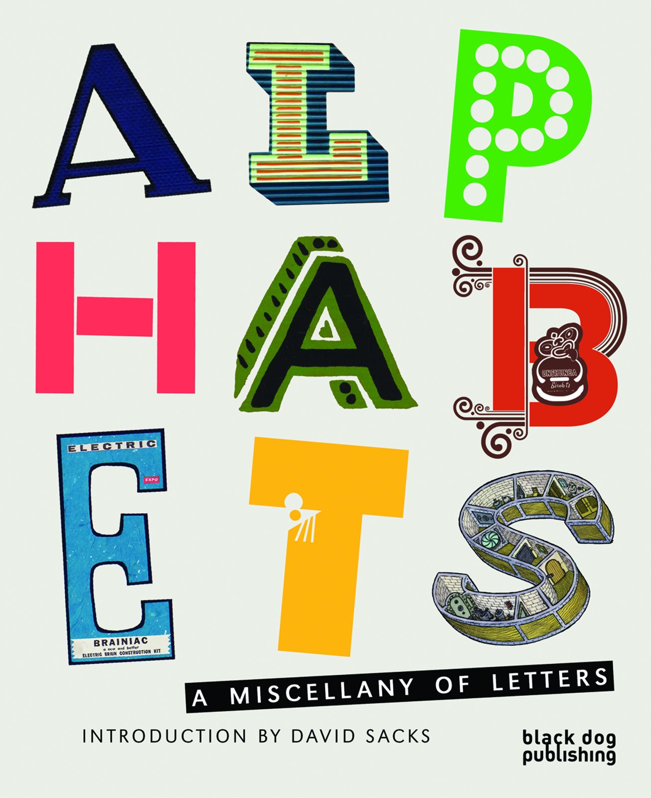
What I liked about this book was its wide scope, usually alphabets would imply type styles, typography for print and digital media. Obviously the letters here include a lot of printed ones but the real fun starts when you see Lisa Rienermann's amazing letters created by photographing buildings looking up towards the sky (unfortunately the complete alphabet isn't shown) or Tim Fishlock's whimsical letters cut from the London subway map. An idea that seems so simple I'm surprised I haven't seen it before.
No book about twenty-six characters would be complete with a brief historical survey of how they got that way and David Sack's eighteen page illustrated essay explains it all. The book then devotes each character to a theme: H is for hands; N is for nature; R is for revolutionary; W is for wit et cetera. It's in these themes that you'll come across all kinds of lettering creativity. Scott Teplin drew an Alphabet for Alphaville: a bird's eye cutaway view of one-story buildings; page 146 has a photo of a chest of drawers, the front of each has a large old fashioned wooden printing type on it; Eric Tabuchi spent four years photographing large individual letters on the back of trucks and nicely all of them are in the same format and scale so the letters are the prominent feature. X is for x-rated, a chance for some gentle erotica including a clever alphabet based on Playboy bunnies. I was surprised that X didn't include Anthon Beeke's nude alphabet he created in 1953.
The book is a handsome production, well designed and printed though I thought the credits on three pages at the back could just as easily have been placed on the relevant pages.
If you want to see a fresh creative approach to the world's favorite characters you'll find them in these pages.
Alphabets: A Miscellany of Letters is available at Amazon (US | CA | UK | DE | FR | IT | ES | JP | CN)


Lisa Rienermann's Type in the sky, 2005.


Left: Tim Fishlock's lovely letters cut from the London subway map.

Right: Eric Tabuchi's truck typography.


Scott Teplin's 2008 Alphabet for Alphaville.

Left: Alphabunnies.

Visit Amazon to check out more reviews.
The links below are affiliate links, which means I earn some commission from each purchase, but at no extra cost to you.
Here are direct links to the book:
Amazon.com | Amazon.ca | Amazon.co.uk | Amazon.de | Amazon.fr | Amazon.it | Amazon.es | Amazon.co.jp | Amazon.cn


Add new comment