
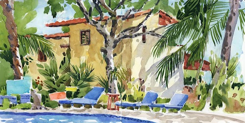
This article is written for beginners who want to have more control over their palettes rather than getting standard off-the-shelf watercolour box sets.
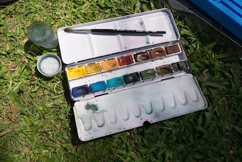
With an empty watercolour box, you have the flexibility to put in specific colours that you like. You select the type of pigment to include, the quality and can even use colours from different brands in the same box.
I've asked several artists and sketchers to include the colours they would pick for a 12-pan palette.
Before I interviewed the following artists, I thought they would be listing rather similar colours. But it didn't turn out the way I imagined. Well, colour is very personal. One may like a particular shade more than another person. So the lists below are more of inspiration rather than an actual guide to selection.

I’ll just give the Daniel Smith colours though there are other brand options of course.
This palette is designed to be used for any subject, with only two colours needed to mix most other colours to save time. The mid yellow could be replaced with a cool lemon yellow such as Hansa Yellow Light but Hansa Yellow Medium is brighter and a stronger mixer and can easily be made more lemon if needed by adding a touch of Phthalo Green (Blue Shade). Quinacridone Gold could also be replaced with a more pure warm yellow such as Hansa Yellow Deep or New Gamboge but I like the mixed greens that can be made with Quinacridone Gold mixed with Phthalo Green (Blue Shade) and the various blues.
There are three reds and three blues so you can make bright purples with the Quinacridone Rose and Ultramarine, dull earth reds with the Phthalo Blue (Green Shade) and Pyrrol Scarlet and clean or dull oranges and greens with the yellows.
Phthalo Green (Blue Shade) is a fabulous mixing colour, as is Burnt Sienna. The green will make a huge range of additional colours quickly when mixed with a yellow for greens, a crimson for blacks and plum and aubergine colours and mossy greens with burnt sienna. Burnt Sienna is also lovely for skin tones and will make a range of greys with Ultramarine.
Goethite could be replaced with Raw Sienna but I love the granulation of Goethite - wonderful for landscapes and rock/stone studies.
Jane’s Grey is a mixture of Burnt Sienna and Ultramarine that I make up. It is similar in colour to Neutral Tint DS but doesn’t contain black so keeps paintings brighter. It is really useful when sketching to have a good dark for shadows and dark details.
For many years I had a basic palette of colours that never changed. It had lots of earth tones and it never contained green — I would always mix those from a variety of yellows and blues. It was mostly made up of Cadmium Yellow, Yellow Ochre, Burnt and Raw Sienna, Cadmium Red and some blues. But a while ago I decided it was time to try some new pigments so I’ve been experimenting a lot lately and I’m happy with the results.
I love trying out new colours so it’s hard to pick twelve and stick to them but here goes. This is what’s in my most recent palette but next week it might be something else:
Yellows: I like to have a warm and a cool yellow so the two I am using now are Azo Yellow (cool) and New Gamboge (warm)
Reds and Oranges: I have given up on the Cadmium hues and now use Pyrrole Orange and Permanent Alizarin Crimson. The orange is great to mix with Cerulean Blue for overcast skies.
Greens: Green Gold or Azo Green (warm) and Phthalo Green (cool) are in my current palette but you could take out the Azo Green and still have lots of possibilities if you mix a bit of yellow into the Phthalo Green. It’s also good for making rich darks, along with Alizarin.
Blues: Cerulean Blue (the lightest blue as well as the most granular and opaque), Cobalt Blue (I use this cool blue in shadows), Ultramarine Blue (great for mixing with Burnt Sienna to make grey), Indanthrene Blue (wonderful for darks)
Earth tones: Burnt Sienna (great for mixing rich darks) and Quinacridone Gold (great for making interesting and rich greens)
- Hansa Yellow Medium - A beautiful bright transparent mid yellow that mixes beautiful greens as well as oranges and just stunning on its own
- Quinacridone Rose - A great mixer - makes beautiful oranges with Hansa Yellow Medium, beautiful purples with Utramarine Blue, vibrant reds with Transparent Pyrrol Orange and gorgeous pinks on its own
- Ultramarine Blue - I find the Ultramarine makes better greens and a more neutral grey with Burnt Sienna than the slightly cooler French Ultramarine
- Burnt Sienna - Experienced watercolour users might like to try Transparent Red Oxide. See this post for more details
- Cerulean Blue Chromium - This is a brighter version of cerulean and perfect for Australian light and sky. I do not recommend the DS Cerulean Blue as it is too weak. The WN version(below) might be more suitable for people in northern hemisphere
- Monte Amiata Natural Sienna - A lovely transparent single pigment alternative to Raw Sienna
The list above are from manufacturer Daniel Smith.
Liz has also provide alternatives for Winsor & Newton and Schmincke that you can check out at https://www.lizsteel.com/2014/10/my-recommended-very-basic-watercolour.html

This is the list of colours mentioned by James Gurney on a post written for beginners who are starting watercolours.

This is my small emergency pocket palette when size and weight is a concern. The colours I picked for this palette contains some of my all time favourites and a few odd left-over colours from previous experiments.
Translucent Orange (Schmincke) and French Ultramarine (Daniel Smith) are two of my favourites. Very versatile colours for mixing with other colours. I also added Lunar black to create a range of muted and neutral colours like dark blues and deep browns.

- Perm Sap Green (Winsor Newton)
- Pyrrole Crimson (Daniel Smith)
- Hansa Yellow Med & Deep (DS)
- Winsor Green Blue Shade (WN)
- Manganese Violet (Schmincke)
- Quinacridone Gold (DS)
- Translucent Orange (Schmincke)
- Lunar Black (DS)
- Burnt Sienna (DS)
- Cerulean Blue Chromium (DS)
- French Ultramarine (DS)

Some colour mixtures

As a professional artist, I use only Artist’s grade paints. Their colours are more vibrant, luscious and longer-lasting than student-grade paints. The list above are all Daniel Smith.
In a 12-colour palette, I make sure that I have all three primary colours in both cool and warm temperatures. For example, Hansa Yellow Light is a cool yellow, while Permanent Yellow Deep is warmer. I also pick colours based on their transparency/opacity and lightfastness. I like using granulating colours such as Moonglow and Lunar Black to create grainy, textured effect on the paper.
My palette
I would go with Daniel Smith also ever since I was sent 10 colours for testing. However, I've updated my selection to the following:
In my updated palette for 2015, I've replaced Daniel Smith's weak Viridian with the much stronger Phthalo Green (BS) which mixes well with reds to form the dark shades for dark trees and vegetation.
Since Lemon Yellow can no longer be shipped to Singapore, I've to use Hansa Yellow Medium in place of that. Transparent Pyrrol Orange is my main red and is one of my favourite colours because it mixes well with Phthalo Blue GS for form really dark blacks.
French Ultramarine and Burnt Sienna are always a staple in my palette. They mixed to a beautiful moody grey with really nice granulation.
Other colours added will make the palette more versatile.
To pick a really minimal palette of 3 and 5 colours, they will be:
3 colours: Hansa Yellow Medium, Transparent Pyrrol Orange and Phthalo Blue GS
5 colours: Hansa Yellow Medium, Transparent Pyrrol Orange, French Ultramarine, Phthalo Blue GS and Burnt Sienna
6 colours: Daniel Smith introductory set of six 5-ml tubes with Hansa Yellow Light, New Gamboge, Quinacridone Rose, Pyrrol Scarlet, Phthalo Green (GS) and French Ultramarine.
The Daniel Smith 6-tube set can be expensive. You'll get more value for money with the Mission Gold 9-tube set or 12-tube set and can get even more paint.
General way to choose colours
There are several ways to choose the colours in your palette.
Most artists go for one set of warm and cool primary colours (yellow, red and blue), and throw in convenient mixtures such as green and other earth colours. Many watercolour artists and books will recommend their palette selection using this method. I personally use this method too.
The other way is to choose colours from around the colour wheel, picking 12 including all the variations of secondary mixtures. This was mentioned in the book Watercolor Artist's Guide to Exceptional Color.
Both ways are versatile.
Most artists go for the first way which is to include more of primary colours rather than convenient mixtures. Many of the colours, especially the secondary mixtures like orange, purple and green, can be mixed easily from primary colours.
For my future palette, I would include 3 sets of primary colours plus Burnt Sienna and maybe two greens for a total of 12 colours. Or I may swap out the green for one more red and blue. Fun!
Cost
My recommendation is to get artist quality paints rather than student grade.
It's better to get less of better quality paint, than more of lousy paint.
I have the 3, 5 and 6-colour selections. I prefer 15ml tubes because they can fill the 2-ml half pans seven times. You can also check out Liz Steel's minimal palette that also features 6 colours.
Generally speaking, the cost of getting an empty palette (~US $25) and 12 empty pans (~ $0.35 each) is around $30, not including shipping.
If you go the Daniel Smith route, that would be ~US $170 for a 12-colour palette. Daniel Smith cost around US$10-15 per 15ml tube. Very expensive!
A cheaper alternative is to go with a M. Graham basic 5 colour-set which my friend Don Low has reviewed before on the blog.
M. Graham has a five-colour basic set for USD $35-40 and ten-colour intermediate set for USD $60-70. You still have to fork out some money for the empty watercolour boxes and pans. But overall it's much cheaper, and I think worth the money because they are artists quality paints too.
Or go for the Kremer Pigments 14-pan basic set 1, if they are still selling, at USD $80.
Well, the two non-Daniel Smith options are sort of going against what this article is talking about, which is to pick your own colours. But for the M. Graham and Kremer Pigments sets, I do think they have a good selection of colours.
More inspiration
If you need more inspiration, check out the watercolour palette forum on WetCanvas.
What's in your palette?
Share your colour selections in the comment section below.
