
A few months ago, Blockx asked if I wanted to help them choose a new set of pan watercolours for their box set. They told me they are going to introduce a new selection of colours for their 12-pan watercolour box set. They actually used to a 12-pan watercolour box set that I've featured before on the blog. Then I realised that they were no longer offering it on Amazon. Now I finally know the reason why.
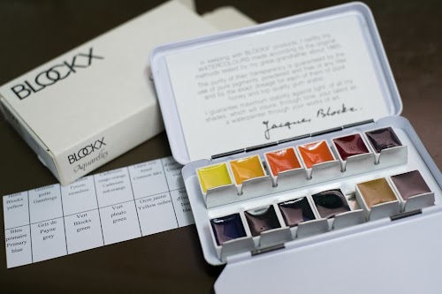
So yesterday, the Blockx pan watercolours arrived. I didn't know they were sending me 28 pans. So many! Luckily I have a spare huge Winsor & Newton palette lying around unused (too heavy) that is now proving to be useful again.
Blockx was established in 1865 by Jacques Blockx I (1844-1913), a chemist. Since the company is focused on the chemistry, they have invited artists to test out their paints.
Here's the list of colours that I have received.
Yellow
314 - Lemon Yellow - PY184 - Semi-opaque, Granulating
212 - Blockx Yellow - PY3 - Transparent, Granulating
313 - Primary Yellow - PY154 - Transparent, Semi-granulating
216 - Gamboge - PY6 - Transparent, Semi-granulating
111 - Yellow Ochre - PY42 - Semi-Opaque, Semi-staining
113 - Gold Ochre - Pbr7 - Transparent, Non-staining
317 - Indian Yellow - PY154 + PO73 - Semi-transparent, Semi-Granulating
220 - Pyrrolo Vermilion - PO73 - Semi-opaque, Semi-staining
Red
327 - Blockx Red - PR254 - Semi-transparent, Semi-granulating
425 - Pyrrolo Red - PR255 - Semi-transparent, Staining
328 - Crimson Lake - PR264 - Semi-transparent, Staining
329 - Quinacridone Magenta - PR122 - Transparent - Semi-granulating
332 - Magenta - PV19 - Transparent, Semi-granulating
234 - Ultramarine Violet - PV15 - Transparent, Semi-granulating
121 - Venetian Red - PR102 - Transparent, Non-staining
Blue
152 - Primary Blue - PB15:3 - Transparent, Granulating
252 - Prussian Blue - PB27 - Semi-transparent, Granulating
253 - Ultramarine Blue Deep - PB29 - Transparent, Semi-staining
452 - Cobalt Blue - PB452 - Transparent, Non-staining
453 - Cerulean Grey - PB35 - Semi-opaque, Non-staining
Green
163 - Blockx Green - PG7 - Transparent, Semi-granulating
261 - Emerald Green (Viridian) - PG18 - Transparent, Semi-staining
165 - Phthalo Green - PG36 - Transparent, Semi-granulating
Earth, greys and black
141 - Burnt Sienna Light - PBr7 - Transparent, Non-staining
148 - Burnt Umber - PBr7 - Transparent, Semi-staining
175 - Payne's Grey - PBk11+PB29+PB15:1 - Semi-transparent, Non-staining
177 - Neutral Tint - PBk11+PB29+PB15:1 - Semi-transparent, Semi-granulating
171 - Ivory Black - PBk9 - Semi-opaque, Non-staining
That's 28 out of their range of 72. Single pigment paints consists 59.
The characteristics, such as transparency and granulation, are taken from the watercolour chart from the Blockx website. But I've provided a sample watercolour chart to test the transparency further below.
Here are my colour swatches:


Most are transparent or mostly except Lemon Yellow, Yellow Ochre and Pyrrolo Vermilion. Venetian Red and Cobalt Blue also look to me like semi-opaque or semi-transparent.
While opaque colours have their useful traits, I personally prefer my pigment selection to be all transparent for easier mixing. Opaque colours will mix to mud very quickly. So straightaway, I know I will not be picking those five colours mentioned in the previous paragraph.
And it's likely I won't be picking Payne's Grey, Neutral Tint, and Ivory Black. I know some people like those convenient colours. But currently my preference is towards using only primary and less of convenient colours. I still find Payne's Grey quite useful though.
My colour selection has been greatly influenced by this book called Confident Color. There's a chapter inside that recommends the different primary colour sets. That has always influenced me. So my preference is towards choosing more primary than convenient. Even the QoR watercolours that I'm still using is devoid of green -- I've removed the weak Viridian.
So currently what I'm leaning towards are
- Blockx Yellow
- Gamboge
- Gold Ochre
- Pyrrolo Red
- Quinacridone Magenta
- Crimson Lake
- Primary Blue (looks like Phthalo Blue)
- Ultramarine Deep
- Cerulean Grey
- Blockx Green (seems more intense than Phthalo Green)
- Burnt Sienna Light (there's a Deep version)
- Burnt Umber or Payne's Grey or something else
That's three sets of primary, one green and two earth.
Burnt Umber's shade can be created from Burnt Sienna by adding Ultramarine. So I'm not sure if I would include Burnt Umber.
There will be more testing and colour mixes coming soon. I'll do a lightfast test too since Handprint mentioned that it may be a problem with some Blockx pigments.


Add new comment